Portfolio
Before and after.
The most honest portfolio.
Every redesign and accessibility improvement I’ve done started with a documented problem and ended with a measurable outcome. This is the evidence.
Before & After Transformations

Visual proof of work.
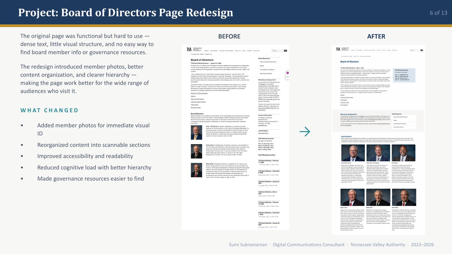
Board of Directors • TVA.com
Functional but hard to use → Clearer hierarchy
Added member photos, reorganized content into scannable sections, improved accessibility and readability, and made governance resources easier to find.
Member photosScannable sectionsGovernance resources findable
Environmental Reviews • TVA.com
Sprawling wall of links → Clear, logical categories
Organized links into clear, logical categories, improved visual hierarchy throughout the page, highlighted key resources and documents, and made NEPA projects easier to locate.
Categorized linksVisual hierarchyKey resources highlighted
My AI Production Workflow
AI supports my work.
AI supports my work.
It doesn’t replace my judgment.
This is how I actually use AI tools in daily production, with a structured human review gate at every stage.
A Disciplined Workflow
Brief
Define the task clearly
Generate
Use AI to produce a draft
Evaluate
Review against TVA standards
Refine
Edit, correct, improve
Publish
Own the final result
Ready for more?
Six case studies.