Case Study 01 of 8
Board of Directors Page Redesign
The original page was functional but hard to use. The redesign introduced member photos, better content organization, and clearer hierarchy.
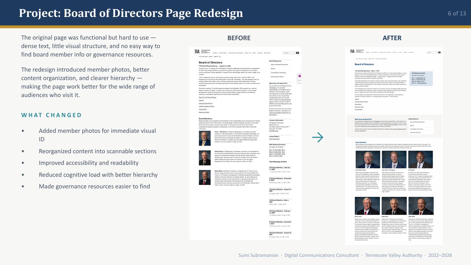
The original Board of Directors page was functional but hard to use: dense text, little visual structure, and no easy way to find board member info or governance resources. The redesign introduced member photos, better content organization, and clearer hierarchy, making the page work better for the wide range of audiences who visit it.
The problem I was solving.
The page was dense text with little visual structure, and there was no easy way to find board member info or governance resources.
What changed.
The technology behind the work.
Measurable results.
The redesign made the page work better for the wide range of audiences who visit it.
Visual transformation
What I learned.
This project reinforced that information architecture decisions carry real accessibility impact. Adding photos wasn’t just an aesthetic improvement. It reduced cognitive load and made the page work better for the wide range of audiences who visit it.